

Quietly elegant, effortlessly serene… the neutral scheme has never gone out of fashion. And with good reason: a beautifully executed neutral colour scheme can transform an interior, enhancing its sense of space and light and creating a soothing backdrop to our busy lives. The important thing to consider when putting together a neutral colour palette is how to ensure that the space is characterful and interesting – a place with true soul, rather than one that is soulless. Read on for our tip tips…
10 neutral colour schemes you’ll love
Classic minimalism

Classic minimalism is all about celebrating space and natural light with pieces that will stand the test of time: think beautifully crafted furniture, considered accessories and elegant soft furnishings. In this pared-back living room, stone flags and neutral walls in horizontal tongue and groove provide a textural backdrop to curated pieces that have been given the space to breathe. The armchair is upholstered in Sienna in Almond, a tactile bouclé fabric in a pale neutral shade, which serves to nicely complement the refined curves of the piece. A retro style floor lamp, a wooden side table and a chunky jute rug introduce stronger neutral tones to the colour palette that lend depth as well as adding more texture to the scheme. Proof positive that a minimalist living room need never be boring.
Serene sophistication

A carefully curated living room will ensure a serene, tranquil feel that sees shoulders drop from ears the moment you enter the space. The focus for this look is on pared-back pieces in soft, neutral tones: here, a classic Saarinen table chimes nicely with the retro style of the chairs, which are upholstered in Malmo in Lagoon, a linen-mix weave that introduces a hint of duck egg blue to the neutral colour scheme. Stone and wood tones complete the gentle palette, while dried flowers and a botanical print add an organic quality to the space.
Rustic charm

Neutral colour schemes work particularly well in a rustic décor where subtle tones team beautifully with natural textures to create a feeling of warmth and familiarity. Seek out artisan-made pieces and fabrics in natural fibres such as cotton, linen and wool. This sofa fabric, Westray in Dove Grey, combines two natural yarns, fine Shetland wool and cotton, to create a tactile weave that has the added advantage of being naturally fire retardant, so it is environmentally friendly, too. It brings a lovely, relaxed quality to this living room and teams well with the wood tones of the pale oak floor.
Modern glam

There are numerous ways in which a neutral colour scheme can be given a glamorous touch, from refined pieces of furniture and accessories to metallic accents that add subtle shimmer to a space. Sophisticated patterns are another fantastic way to elevate a neutral decorating scheme, as witnessed here where a stylish abstract wallpaper, The Wave in Smoke, brings elegance to a pale bedroom. The pattern of undulating waves was inspired by an archive design discovered in Paris, while its subtle grey colour palette ensures a soothing feel. A wonderful way to bring movement and depth to the walls in a neutral decorating scheme.
Scandinavian simplicity

A neutral colour palette lends itself well to a Scandinavian style living room, where the emphasis is on celebrating beautifully designed pieces of furniture and accessories. In this living room, walls in a chalky white are teamed with tongue and groove panelling in a pale, warm grey to create a light, airy feel. The corner sofa – a modern, inviting piece that is perfect for both sociable gatherings and for stretching out on – is upholstered in Elba in Pearl Grey, a dyed and tumbled pure linen fabric in a warm neutral that works perfectly with the soft colour palette. Pieces in natural materials, including a wooden coffee table and a bent wood light shade, add character to the space.
Eclectic bohemian

Bohemian interiors are having a moment, with artisanal-style pieces in natural materials such as rattan, bamboo and wood bringing personality to interiors. A neutral colour scheme is the perfect partner to bohemian pieces, as are natural, breathable fabrics such as linens and cottons. In this neutral living room, a tumbled linen fabric, Elba in Dove, creates an informal window treatment – note how the curtains have been designed to trail on the floor to further the relaxed feel. The same Elba linen fabric, this time in the Eggshell and Bisque colourways, was used to create two-tone cushions for the rattan lounger, a gorgeous mid 20th century piece that encapsulates eclectic bohemian style.
Floral elegance

A floral fabric in a muted colour palette is a lovely way to bring nature into a neutral scheme. In this informal breakfast nook, a linen floral stripe, Hester in Grey, has been used for the blind and cushions to enliven a palette of soft tonal greys. A small-scale linen print, Bagatelle in Mead, picks up on the ochre tone in the stripe and introduces another organic pattern to the mix, while the banquette seat in a grey-green linen-mix fabric, Juno in Sea Salt, provides a calming backdrop. Natural materials including bamboo, wood and rattan bring a tactile element to this neutral decorating scheme.
Bold accents

Don’t be afraid to introduce dark hues into your neutral colour palette. A pop of anthracite or charcoal throws the paler colours into sharp relief, as well as helping to ground pieces within the space. You can introduce dark accents in a discreet way with accessories such as a lamp or a small piece of furniture or go for a braver approach by painting walls a dark neutral shade. In this living room, both the walls and panelling were painted a rich anthracite grey as a foil to soft furnishings in pale neutral tones. The dark colour helps to bring attention to the subtle pattern and smart lustrous sheen of the curtain fabric, Miletto in Eggshell, a glorious contemporary-style damask.
Gallery wall
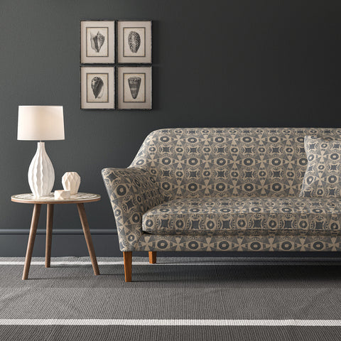
An important tip to avoid a neutral living room looking soulless is to focus on the details: a gallery wall of art, for example, will bring life to a space and create a talking point within the room. Try assembling artworks that share the same neutral tones or focus on frames that unite different pieces and mediums. Also consider the wall colour: white or off-white is a perennial favourite, but dark neutral shades can also be an interesting choice. Here, a wall in a deep, rich grey nicely picks out the colour of a set of vintage prints of seashells, which are hung off-centre for a more interesting approach. The sofa fabric, Starship in Elephant from the Omega II printed velvets collection, ties in perfectly with the dark neutral tones and introduces a striking contemporary print to the scheme.
We hope we have revealed just how versatile a neutral palette can be, providing a backdrop for treasured pieces to shine. A restrained backdrop also makes it easy to edit your home as time goes on, adding pieces of furniture and art that reflect your personality. Don’t forget to use deeper tones to help ground pale colours and never skimp on texture: a variety of tactile materials will ensure that your neutral scheme is interesting, and a joy to spend time in.